 Reading Time: 5 minutes
You don’t have to be a marketer to appreciate a good call to action (CTA), and it’s easy to tell when users appreciate them. Because you know, conversions happen.
But there are some sites that do it better than others, and as we’ll see in the examples below, not all of them take place online and not every CTA is about getting users to do something. Sometimes, they’re about preventing users from doing something.
Good Example 1
Netflix
I know. You’re shocked, right? One of the biggest names in online entertainment streaming is a good example of using a proper CTA. Netflix’s CTA “Watch free for 30 days” is simple and similar to one that gets used and abused across the net: “Sign up for a free trial.”

But Netflix doesn’t just don’t stop here; throughout the homepage, Netflix emphasizes the free trial and also makes it more enticing:
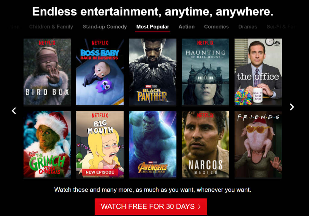
Regardless of your opinion of these shows, all of them are being discussed online in some manner. Netflix is telling potential customers they can check out everything they’re hearing their friends talk about by signing up for a free trial.
If that’s not enough, Netflix shows more options for service and even downloaded with a free trial:
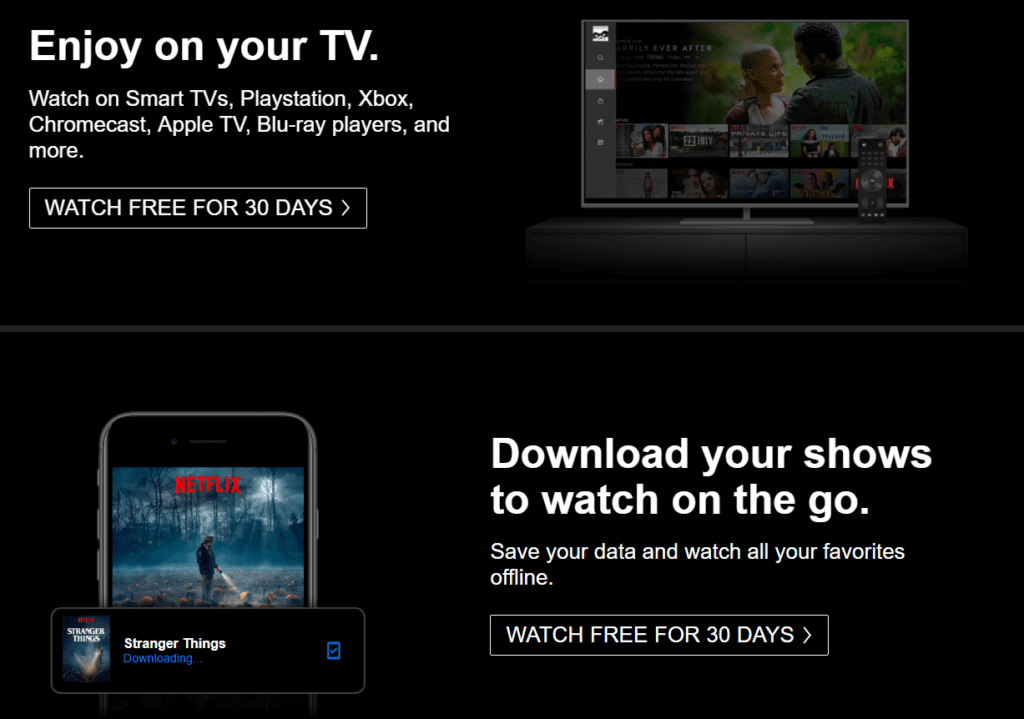
The thing I really like about Netflix’s offering here is that it isn’t just a typical free trial—it’s an actual trial with no user restrictions. Why is that important? It keeps the CTA honest. There’s no restricted “free account” that many businesses bait users into. Others often call it a “free trial” when it’s really a free account with limited functionality.
Offering a restricted free trial or even full service with no guarantee of getting business is a risk. But providing something users want and being honest about it lays an early foundation for a positive relationship. Trial customers become repeat customers later because of the trust established.
Netflix does a great job here because not only is the message centered on the various ways to use the service, but also trust is established with users who take advantage of the trial.
Good Example 2
Point Blank SEO (R.I.P.)
Sadly, the second example of a great CTA, and my go-to example for the SEO industry, was sold in 2018. But kudos to Jon Cooper for the sale and his new venture.
Thanks to the Wayback Machine, we can revisit what the site used to look like and see the CTA. This first screenshot is of the signup for the link building course that he used to offer:
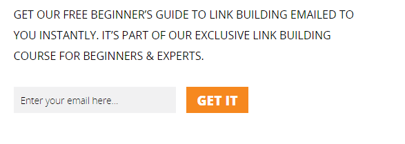
What I really love about this is the “Get It” button. Users aren’t being asked to “submit”; they’re being told if they enter an email, they’ll get something. All they need to do is put in an email address to get it. Literally.
This next one from Point Blank SEO shows the following:

If you’ve ever had the chance to interact with Jon on Twitter, read his articles, or even chat with him at a conference, you know he’s really passionate about what he does. These emotions are crystal clear in the CTAs on the Point Blank SEO site. Reading the content, the buttons, and the links gets users just as excited about signing up as Jon is about the content he’s going to provide.
In short, use words that tell users what they’ll get by providing you a bit of information. Stay away from “submit” or “click here.” Use passion in your writing and CTAs. If you aren’t excited about what you’re providing users, why should they be excited about signing up?
Good Example 3
Loot Crate
I subscribed to Loot Crate for a few years and have obtained an ungodly amount of pop culture geek stuff from them over the years. But the time eventually came for me to unsubscribe and stop the many, many boxes being sent to my house. I was expecting the unsubscribe process to work similarly to how most other email unsubscribe processes work: you click unsubscribe and presto, you’re done. Maybe you get the annoying “Are you sure you want to leave?” email or “This is an email confirming your choice to unsubscribe,” but instead Loot Crate presents this:
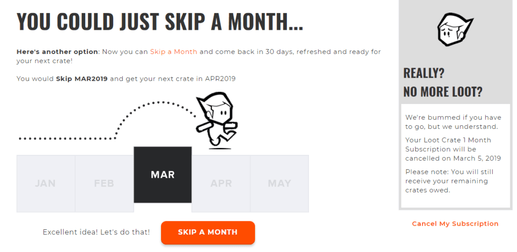
Now, I know this might seem a bit sketchy—not giving users a direct way out. But CTAs by definition are intended to get users to take a specific action the business/site wants them to take. So yeah, they may not want users to leave, but this is actually clever because it shows they know their audience and their products.
Probably not every user of Loot Crate loves every single crate, and Loot Crate is aware of that. So instead of giving an immediate way out, they give the option to just skip a month. Until I got to this page, that wasn’t something I had thought of.
They’re still giving users an option to cancel, but again, they aren’t highlighting it as well as they are the “Skip a Month” option. The dark shading and orange anchor text link make it seem almost like a sidebar rather than a CTA. In this case, there is an absence of a CTA, discouraging users to follow through with complete cancellation.
Loot Crate is making an attempt at a compromise to users who want to leave, and I think it’s an admirable attempt. They recognize why users might want to leave and give them an alternative option, but they don’t trap them. I’m sure there are going to be mixed feelings on this, but I can appreciate it.
Three Quick Points
The three CTA examples presented can be summarized in the following ways:
-A free trial (Netflix)
-Using verbiage other than “Submit” (Point Blank SEO)
-Preventing users from cancelling right away (Loot Crate)
But there’s much more to it than this. The examples shown are from sites that have taken the time to understand their users and who they want to convert. They’re establishing trust, getting users excited, and acknowledging why some might want to cancel their services.
At the end of the day, honesty and passion go a long way toward helping to fully convert users. A good CTA can help gather a great deal of potential client information. A great CTA will convert that data into sales once users have gotten a chance to know the business.
Your CTAs are often the first impressions users will have about your site. How will you choose to solidify that impression?
At Vizion Interactive, we have the expertise, experience, and enthusiasm to get results and keep clients happy! Learn more about how our CRO services can increase sales and boost your ROI. But don’t just take our word for it, check out what our clients have to say, along with our case studies.

