

Table of Contents
- Website Structure and Architecture for Ecommerce Sites
- Types of Website Architecture
- Elements of Website Architecture for On Site SEO
- Ecommerce Site Best Practices for Website Architecture
- Page Speed
- How to Improve a Website Page Loading Time
- Mobile Friendliness
- Mobile-Friendly Designs Help Search Engines
- Mobile-Friendly Content and On Page SEO
- Mobile-Friendly Navigation
- Mobile-Friendly Forms
- Mobile Friendly Optimization
- Accessibility
- Accessibility Standards
- Accessibility Features
- How to Make Your Website Accessible
- Do You Need Our Help to Implement Technical SEO for Your E-commerce Website?
Ecommerce SEO entails understanding how people search for your products and then optimizing pages to rank for those terms. Given such massive competition in search, you must offer the best user experience possible. That’s why you’ll have to look into your website’s technical elements to avert errors that could hurt search performance at a given point.
The most critical reason you should look into your ecommerce website’s technical elements is to improve your organic visibility, in order to capture your part of the rapid e-commerce growing industry. Statista predicts that there’ll be total e-commerce sales growth worth $8 trillion by 2026.
To be part of this growth, you must optimize your site’s backend to deliver a positive front-end experience. Read on to learn more about technical elements to consider for e-commerce websites and how it helps online stores rank higher.
“When we take on new clients, one of the first deliverables we create is a technical SEO audit. This gives us the opportunity to identify and address the priority technical issues because sometimes they can dramatically prevent the search engines’ ability to discover and index products in a timely manner. This is important because things like product descriptions, pricing, and availability may change multiple times per day, and it’s important that your products are shown accurately in the search results”
– Reuben Yau
VP SEO – Vizion
Website Structure and Architecture for Ecommerce Sites

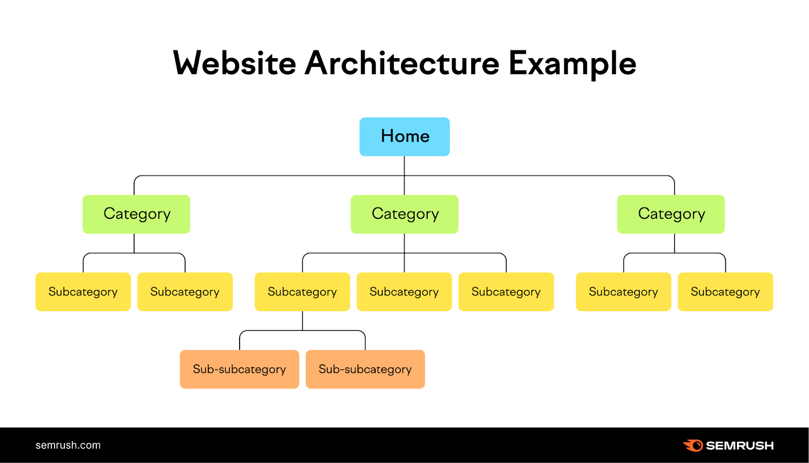
Site architecture represents your website pages’ hierarchical structure. It’s reflected via internal linking, and it helps users quickly find information while helping search engine crawlers understand the relationship among the different pages. It should be at the top of your ecommerce seo checklist.
Your website’s structure is undoubtedly critical in boosting conversions and retaining users. Also, an ideal site structure follows a standard catalog.
A simple site structure should be like the one below:
Homepage > Categories > Sub-Categories > Products
Site architecture is critical for ecommerce SEO because of the following:
- It helps visitors identify the content they’re looking for
- Website architecture can help improve the spreading of authority across your web pages through internal links
- It helps search engines to find and index all your website pages
Internal linking creates website structure; linking to similar pages can give readers and Google more context regarding that page.
Website architecture can help users find the information they are looking for quickly and easily. A well-structured website is easy for search engine bots to crawl and index.
When designing your website architecture, it’s essential to consider your target audience and their needs. You should also ensure your website is easy to navigate on desktop and mobile devices.
By following these tips, you can create a user-friendly and SEO-friendly website.
Types of Website Architecture
Let’s look at two types of site architecture:
Flat architecture
Flat architecture is a website structure that focuses on organizing content in a hierarchical manner, with a minimal number of levels between the homepage and individual pages. In terms of search engine optimization (SEO), flat site architecture offers several pros and cons that can impact a website’s visibility and ranking. Let’s explore them in detail:
Pros of Flat Architecture for SEO:
- Improved crawlability: With fewer levels of navigation, search engine bots can easily crawl and index the content on your website. This ensures that all your pages are discovered and included in search engine results, increasing your visibility.
- Enhanced user experience: Flat architecture simplifies the navigation process for website visitors. Users can quickly find the information they need without having to go through multiple levels of menus or categories. This can lead to longer visit durations and lower bounce rates, which are positive signals for search engine bots.
- Efficient internal linking: Flat architecture promotes efficient internal linking, allowing you to distribute link authority and relevance more effectively across your pages. This can help search engine bots understand the importance and relationships between different pages on your site, ultimately benefiting your overall SEO efforts.
- Higher page authority: When your website has a flat architecture, it concentrates the link equity from external sources and internal links onto fewer levels. This means that each page has a higher likelihood of receiving a greater share of link authority, which can positively impact its ranking potential in search results.
- Targeted keyword optimization: With a flatter structure, it becomes easier to optimize individual pages for specific keywords. Each page can be focused on a particular topic or theme, allowing you to target relevant keywords more precisely. This can lead to better visibility in search engine results for specific search queries.
Cons of Flat Architecture for Ecommerce SEO:
- Limited depth of content: One of the drawbacks of flat architecture is that it may limit the amount of content you can showcase on your website. With fewer levels, it can be challenging to organize and present a large volume of content without overwhelming the user or cluttering the navigation.
- Potential keyword cannibalization: When you have multiple pages targeting similar keywords within a flat architecture, there is a risk of keyword cannibalization. This occurs when multiple pages compete for the same keyword, leading to confusion for search engine bots and potentially diluting the ranking potential of each page.
- Lack of thematic grouping: Flat architecture may result in a lack of clear thematic grouping of content. Without proper organization, it can be harder for search engine bots to understand the relevance and relationships between different topics covered on your site. This can impact the overall topical authority and keyword relevance of your website.
- Reduced internal linking opportunities: While flat site architecture can enhance internal linking within each level, it may limit the opportunities for cross-linking between different levels or categories. Internal linking helps search engine bots navigate and understand your website structure, so a lack of cross-level linking can hinder their ability to discover and rank your pages effectively.
- Potential for orphaned pages: With a flatter structure, it’s important to ensure that every page has clear and logical links from the homepage or higher-level pages. Otherwise, there is a risk of orphaned pages that are not connected to the main navigation, making them difficult for search engines to find and include in search results.
A flat architecture does offer some advantages for ecommerce SEO, such as improved crawl-ability, enhanced user experience, efficient internal linking, higher page authority, and targeted keyword optimization. However, it does have many limitations, including scalability, limited content depth, potential keyword cannibalization, lack of thematic grouping, reduced internal linking opportunities, and the possibility of orphaned pages. When implementing flat architecture, it’s essential to carefully plan and optimize your website structure to maximize the benefits while mitigating the potential drawbacks.
- Hierarchical architecture
Hierarchical architecture is a website structure that organizes content in a hierarchical manner, with multiple levels of navigation and categorization. This type of ecommerce site architecture has its own set of pros and cons when it comes to ecommerce SEO. Let’s delve into the advantages and disadvantages of hierarchical architecture for SEO:
Pros of Hierarchical Architecture for Ecommerce SEO:
- Structured organization: Hierarchical architecture allows for a structured organization of content, with clear categories and subcategories. This helps search engine bots understand the hierarchical relationships between different pages, making it easier to index and rank them accordingly.
- Thematic grouping: With hierarchical architecture, you can group related content under relevant categories. This enhances the topical relevance and topical authority of your website, as search engine bots can identify the themes covered and the depth of your expertise in each area.
- Keyword targeting: Hierarchical architecture provides an opportunity to target specific keywords at different levels of the hierarchy. By optimizing category and subcategory pages for broader keywords and individual pages for more specific keywords, you can improve your website’s visibility in search engine results for a wide range of search queries.
- Internal linking opportunities: With multiple levels of navigation, the hierarchical architecture facilitates ample internal linking opportunities. Internal links help search engines navigate your website and understand the relationships between different pages. By strategically linking relevant pages within the hierarchy, you can distribute link authority and relevance effectively.
- Deep content organization: Hierarchical architecture accommodates the organization of a large volume of content without overwhelming the user. By providing clear paths to deeper content through categorization and subcategorization, you can ensure that all your pages are easily accessible and discoverable by search engines.
Cons of Hierarchical Architecture for Ecommerce SEO:
- Complex navigation: The multiple levels of navigation in hierarchical architecture can sometimes result in complex navigation structures. If the navigation is not intuitive and user-friendly, it may lead to a poor user experience, higher bounce rates, and lower search engine rankings.
- Difficulty in indexing deep content: While hierarchical architecture allows for deep content organization, search engines may face challenges in indexing and ranking content that is buried deep within the hierarchy. If important pages are located several levels deep, they may receive less visibility and organic traffic compared to pages closer to the homepage.
- Unequal link distribution: In hierarchical architecture, link authority and relevance may not be distributed evenly across different levels and pages. The top-level pages often receive the most internal and external links, while deeper pages may have fewer links pointing to them. This imbalance can affect the ranking potential of deeper pages.
- Thematic dilution: With hierarchical architecture, there is a risk of diluting the thematic relevance of individual pages. If a page belongs to a broader category, its relevance to specific keywords or topics may be diluted by the overall theme of the category. This can impact its ranking potential for targeted search queries.
- Increased page load times: Depending on the size and complexity of the hierarchical structure, websites with hierarchical architecture may experience slower page load times. This can negatively impact user experience and search engine rankings, as both users and search engines prefer fast-loading websites.
For ecommerce SEO, a hierarchical architecture offers some great advantages such as structured organization, thematic grouping, keyword targeting, internal linking opportunities, and deep content organization. However, it also has drawbacks including complex navigation, difficulty in indexing deep content, unequal link distribution, thematic dilution, and increased page load times. When implementing hierarchical architecture, it’s crucial to strike a balance between organization and user-friendliness, ensuring that all pages are easily accessible and optimized for search engine visibility.
Elements of Website Architecture for On Site SEO
Below are the five fundamental elements of website structure for your ecommerce site:
- Navigation
Navigational elements help reinforce hierarchy within your site architecture, allowing search engines to understand your top priority pages. Navigation also creates a clear pathway for customers to achieve their goals on your website.
It’s safe to say that navigation is one of your page’s most influential design aspects.
- Breadcrumbs
A customer may be window shopping on your website. Most likely, they won’t head straight to the product they want. They’ll look at other options and bounce between different categories and products.
Breadcrumbs communicate to users their location within your website structure and, at the same time, offer a quick navigation path to the parent category. Breadcrumbs offer search engines more context regarding your website’s hierarchy.
It’s essential to implement a breadcrumb structure matching your site navigation.
- Infinite Scroll Ecommerce SEO Concerns
Infinite scroll, refers to a web design technique where content continuously loads as the user scrolls down the page, eliminating the need for pagination. While endless scroll can offer a seamless user experience, it can present some challenges from an SEO perspective. Here is a summary of the issues caused by endless scroll for ecommerce SEO:
- Indexing and crawl-ability: Endless scroll often relies on JavaScript or Ajax to load content dynamically. Search engine bots may have difficulty crawling and indexing this content, leading to incomplete or missed indexing of important pages.
- Page authority and ranking distribution: With endless scroll, all the content is typically contained within a single URL. This means that the page authority and ranking signals are concentrated on a single page instead of being distributed across multiple pages. This can affect the visibility and rankings of individual pieces of content.
- Metadata and optimization: Since all the content is loaded on a single page, there may be limited opportunities to optimize metadata such as titles, descriptions, and headers for specific sections or pieces of content. This can make it harder for search engines to understand the relevance and context of the content.
- Page load speed: Endless scroll can lead to a large amount of content being loaded, potentially resulting in slower page load times. Page speed is a crucial ranking factor, and slow-loading pages can negatively impact user experience and search engine rankings.
- User engagement and bounce rate: Endless scroll may increase the time users spend on a page, but it can also make it difficult for them to find specific information or navigate to other sections. This can lead to higher bounce rates and lower engagement metrics, which can indirectly affect ecommerce SEO performance.
- URL structure and shareability: With endless scroll, the URL typically remains the same as the user scrolls, making it challenging to share or bookmark specific sections of content. This can limit the potential for backlinks and social media sharing, which are important for ecommerce SEO.
It’s important to note that while these issues exist, they can be mitigated or overcome with proper implementation and optimization techniques. If you choose to implement endless scroll, it’s advisable to work closely with developers and SEO professionals to ensure the best possible user experience and maintain SEO visibility for your content.
- Pagination Best Practices

When it comes to paginated pages and ecommerce SEO, there are several best practices you can follow to optimize your website for search engines. Here are some recommendations:
- Implement a rel=”next” and rel=”prev” markup: Use the rel=”next” and rel=”prev” link attributes to indicate the relationship between paginated pages. This helps search engines understand the pagination structure and consolidate ranking signals. Despite Google no longer honoring these tags, other search engines do.
- Provide a clear pagination navigation: Include a clear and user-friendly navigation system that allows visitors to easily move between paginated pages. This improves user experience and helps search engines crawl and index your content more effectively.
- Generate a sitemap: Include paginated pages in your XML sitemap to ensure search engines can discover and crawl them easily.
- Monitor user engagement signals: Analyze user engagement signals, such as bounce rate, time on page, and click-through rates, to assess the effectiveness of your paginated content. Adjust your strategy based on these insights to improve user experience and SEO performance.
Remember, these best practices are intended to enhance the SEO of your paginated pages. Always prioritize creating high-quality and valuable content that satisfies user intent, as search engines ultimately aim to deliver the most relevant and useful results to their users.
- URLs
When it comes to URL formats for ecommerce SEO, there are a few best practices that can help improve the visibility and ranking of your web pages in search engine results. Here are some guidelines for creating SEO-friendly URLs:
Use descriptive and concise URLs: Ensure that your URLs reflect the content of the page and are easy to understand for both search engines and users. Include relevant keywords that accurately describe the page’s topic or content.
Example:
Good URL: https://www.example.com/category-outdoor
Bad URL: https://www.example.com/category.php?id=12345
Keep URLs short and simple: Shorter URLs are generally easier to read and remember. Avoid using unnecessary parameters, numbers, or special characters unless they are crucial for identifying the page’s content.
Example:
Good URL: https://www.example.com/products/flak20xl
Bad URL: https://www.example.com/product/W0OO9188?variant=888392225245
Use hyphens to separate words: Hyphens (-) are preferred over underscores (_) for word separation in URLs. Search engines treat hyphens as word separators, making it easier to interpret the individual words in the URL.
Example:
Good URL: https://www.example.com/product/red-shoes
Bad URL: https://www.example.com/product/red_shoes
Use lowercase letters: URLs are case-sensitive, and using lowercase letters exclusively helps avoid confusion and potential duplicate content issues.
Example:
Good URL: https://www.example.com/category/electronics
Bad URL: https://www.example.com/category/Electronics
Avoid using unnecessary folders or subdomains: Keep the URL structure simple and straightforward. Unnecessarily complex folder or subdomain structures can make URLs longer and harder to understand.
Example:
Good URL: https://www.example.com/category-outdoor
Bad URL: https://www.example.com/category1/subcategory1/subcategory2/outdoor
Implement canonicalization: To prevent duplicate content issues, use canonical tags or 301 redirects to ensure that multiple URLs with similar content are consolidated to a single preferred version. Ensure all redirects point to the final destination and not another redirect (avoid redirect chains).
Example:
Good URL: https://www.example.com/product/red-shoes
Canonical URL: https://www.example.com/product/red-shoes
By following these guidelines, you can create SEO-friendly URLs that are more likely to be understood by search engines, improve the user experience, and potentially enhance your website’s visibility in search results. Remember that URL structure is just one aspect of SEO, and it should be complemented by other optimization techniques for the best results.
Preventing Indexation
There may be situations where you want to prevent search engines from indexing a page or section of the website. The reasons to do this could range from privacy or limiting access to certain content (pay ways) to preventing duplicate content or testing and development. You can accomplish this by using robots.txt file derivatives or by using specific meta tags.
- The “robots.txt” file option is used to tell search engine bots which pages they’re not allowed to crawl or index.
- It’s important to note that while the “robots.txt” file provides instructions to well-behaved search engine bots, some bots may ignore these instructions. To enforce stronger restrictions on page indexing, you can also use additional methods like meta tags (e.g., “noindex”) or password protection.
- By using the “noindex” meta tag on a web page, you communicate to search engine bots that they should not include that page in their index. This effectively prevents the content of the page from appearing in search engine results, ensuring its exclusion from indexing.
- Search engines will have to crawl the URL in order to see the meta tag. This can cause the page to appear in very specific searches, but the content of the page doesn’t usually appear in the SERP.
- To confirm that the web page is excluded from indexing, you can use tools provided by search engines like Google’s “URL Inspection” tool. Enter the URL of the web page and check if it is marked as “Blocked from indexing.”
- The following are some examples of common mistakes website owners make when blocking access to certain pages or sections of their website, be sure to avoid these mistakes.
-
- Removing paginated pages from search engines: Some website owners may decide to block paginated pages, thinking they’re a duplicate content issue since the main content on the page doesn’t change too much from page to page. For an e-commerce site, these pages provide valuable internal links to product pages and should never be blocked from crawling. You can test a “follow,noindex” meta tag if you are concerned with duplicate content, but be sure to monitor URL index count and ranking performance. If you see declines around the products those paginated pages link to, you may want to remove the tag. Matt Cutts of Google discusses this strategy here:
- Blocking the entire website: Mistakenly blocking the entire website using the “robots.txt” file can prevent search engines from accessing any of the web pages. This can result in the website being completely excluded from search engine results. It is important to double-check the “robots.txt” file to ensure it doesn’t block the entire site.
- Incomplete or incorrect syntax: Incorrect syntax in the “robots.txt” file can lead to unintended consequences. Small errors like missing slashes or incorrect directives may cause search engines to misinterpret the instructions or fail to recognize them altogether. Careful attention to syntax and proper formatting is crucial.
- Inadequate testing: Failing to test the “robots.txt” file properly can lead to unexpected outcomes. It’s important to use tools provided by search engines to verify whether specific pages or sections of the website are correctly blocked or allowed for indexing. Regular testing ensures that the desired pages are blocked while allowing access to those that should be indexed.
- Blocking important pages: Website owners may accidentally block critical pages from search engine indexing. This can happen due to misconfigured “robots.txt” directives or incorrect use of meta tags. It’s essential to review the instructions carefully to avoid unintentionally excluding essential pages that should be indexed.
- Forgetting to update the file: When making changes to the website structure or adding new pages, website owners may forget to update the “robots.txt” file accordingly. As a result, new pages may not be indexed, or previously blocked pages might become accessible to search engines. Regularly reviewing and updating the “robots.txt” file is necessary to ensure it aligns with the website’s current configuration.
- Ignoring other indexing methods: Relying solely on the “robots.txt” file for blocking search engine access can overlook other effective methods. Supplementing “robots.txt” with additional techniques like using meta tags (“noindex”) or password protection can provide more comprehensive control over page indexing.
-
- Sitemaps
A sitemap is your website’s blueprint that enables search engines to find, crawl, and index all of a website’s content. Also, sitemaps communicate to search engines the pages on your site that are most critical.
Here are the four main types of sitemaps:
- Image sitemap: For Google to find all the images hosted on your website.
- News sitemap: Aids Google in finding content on Google News-approved sites.
- Video sitemap: This helps Google to understand your site’s video content.
- Normal XML sitemap: It’s usually an XML sitemap that links different pages on your site.
Splitting up an XML sitemap into multiple smaller sitemaps can be beneficial in certain situations. Here are some instances where you might consider splitting up your XML sitemap:
- Large website: If you have a large website, creating multiple XML sitemaps by category or site section, allows for better organization and management of the URLs. This allows you to monitor how each category or site section is being indexed in the Google Search Console Sitemaps report, take a look at this example:
 In this example, if you click on the first Sitemap Index that shows 18,643 Discovered pages, you can then get a breakdown of indexing for each of it’s child XML sitemaps:
 Structuring XML sitemaps this way can be extremely useful when troubleshooting or diagnosing technical site issues which may be impacting the search engines’ ability to find all of your content.
 - Priority and frequency of content updates: If your website has different sections or categories with varying update frequencies or importance, you can create separate sitemaps for each section. This allows search engines to understand the priority and freshness of different parts of your website.
- Multi-language or multi-regional websites: If your website serves multiple languages or regions, it can be beneficial to create separate sitemaps for each language or region. This helps search engines understand the targeted audience and deliver relevant search results.
- Specific content types: If your website contains different types of content such as blog posts, product pages, videos, or images, you can create separate sitemaps for each content type. This helps search engines understand the structure and hierarchy of your website’s content. This can also help with troubleshooting indexation issues, by allowing you to see which segments/categories of the architecture the search engines are having problems crawling.
By splitting up your XML sitemap based on specific criteria, you can provide search engines with more focused and targeted information about your website’s content. This can enhance the crawl-ability, indexing, and ranking of your web pages, leading to improved visibility in search engine results. These can be controlled and monitored through Google Search Console.
- Internal links
They show context through anchor text, link intent, and page relevance. Internal links also pass crucial page rank, or link equity, to your website’s most critical lead-generating landing pages.
It’s vital to link to your most essential URLs regularly, more so from your navigation, homepage, and other relevant pages with authoritative backlinks. If you’ve already prioritized backlinking, you should focus on internal linking.
Ecommerce Site Best Practices for Website Architecture
An excellent ecommerce site architecture means you have a well-structured site that’s easy to navigate. It has internal linking, sitemaps, category pages, breadcrumbs, and simple URLs.
Let’s evaluate some of the best practices for website architecture.
- You should group content topically
- Organize content in a logical hierarchy
- Use clear and concise navigation
- Create meaningful URLs
- Use breadcrumbs to help users track their progress
- Submit a sitemap to Google Search Console
- Use internal links to connect related pages
Page Speed
Website page loading time is the estimated time to load and display an entire web page content in the browser window.
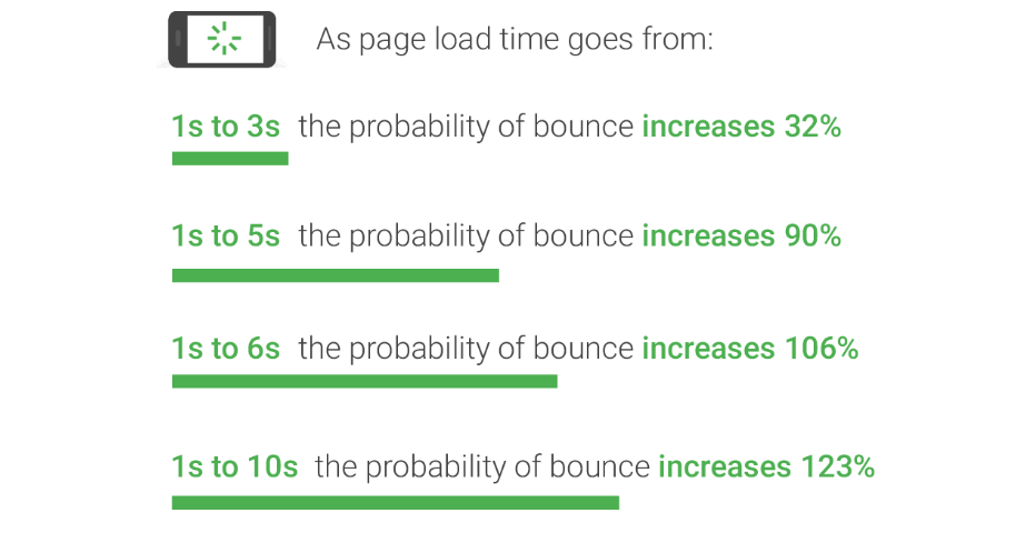
Image Source: Think With Google
Its measurement is in seconds and from the navigation start to the start of the load event. A page load time is a website performance metric directly impacting user engagement.
It shows how long a page takes to load fully in a browser once a user makes a request or clicks a link.
Sites and web services with faster loading times offer better engagement and conversion rates. Significant revenue margins depend on pages with shorter loading times. Here are a few studies to prove it:
- After a month of reducing page load time from 7 seconds to 1.5 seconds, GQ magazine experienced an influx of unique visitors from 6 million to 11 million. Additionally, there was a 108% increase in ad interaction rate, thanks to the rise in median time spent on the website from 5.9 to 7.8 minutes.
- Financial Times looked into how speed impacts user revenue and engagement. They discovered that a one-second delay in page loading time led to a 4.9% drop in total articles read, and a three-second delay led to a 7.2% drop.
- Google discovered that half a second increase in page load time, from 0.4 to 0.9 seconds, led to a 20% drop in revenue and traffic.
So, why does page load speed impact your ecommerce SEO campaign? Page load speed is crucial for SEO because it’s a key determining factor for Google’s algorithm. Slow websites repel visitors, while faster sites offer a great user experience, and Google ranks the sites higher than the slow-loading pages.
How to Improve a Website Page Loading Time

Image Source: Tool Tester
There are actions you can take to improve your page loading time. They are:
Optimize images
Optimizing images involves decreasing their file size using a script or plugin. Doing so speeds up the page’s load time. Lossy and lossless compression are the two commonly used methods.
Minify CSS and Javascript
When you strip unneeded data from your CSS code, minification enables the browser to download and process the files faster, which increases page performance and improves user experience.
Among the many benefits of minifying your JavaScript and CSS are significantly reduced file sizes, making them quicker to load on your blog or website. You’ll also experience better compression for the code, which makes it smaller, increasing download speeds, and you won’t need minification.
Here’s a summary of why it’s good to minimize CSS and JavaScript for SEO:
- Faster page load speed: By minimizing CSS and JavaScript files, you reduce the overall file size and the number of server requests required to load a web page. This optimization improves page load speed, which is a crucial factor for both user experience and search engine rankings. Faster-loading pages tend to have lower bounce rates and higher engagement, positively impacting SEO performance.
- Improved mobile experience: With the increasing use of mobile devices for browsing, having a fast and optimized mobile experience is vital. Minimizing CSS and JavaScript reduces the amount of data that needs to be downloaded and processed on mobile devices, resulting in quicker loading times and a smoother user experience. Google also considers mobile-friendliness as a ranking factor, so optimizing for mobile can improve your on page SEO.
- Enhanced crawl-ability and indexing: Search engine bots crawl and index web pages to understand their content. By minimizing CSS and JavaScript, you make it easier for search engines to access and parse the essential content of your pages. This can help search engines better understand the relevance and context of your content, potentially leading to improved rankings and visibility.
- Reduced potential for rendering issues: Large or complex CSS and JavaScript files can sometimes cause rendering issues on certain browsers or devices. These issues can negatively impact user experience and lead to lower search engine rankings. Minimizing CSS and JavaScript can help mitigate rendering problems and ensure consistent presentation across different platforms and browsers.
- Facilitated site maintenance and updates: Having a minimized and optimized CSS and JavaScript codebase makes it easier to maintain and update your website. It improves developer efficiency, reduces the risk of introducing errors or conflicts, and allows for smoother implementation of future changes. This streamlined process enables you to quickly adapt your ecommerce SEO strategy to best practices and algorithm updates.
Remember, while minimizing CSS and JavaScript files can be beneficial for SEO, it’s essential to strike a balance between optimization and functionality. Make sure not to compromise the functionality or user experience of your website during the optimization process. Always test and monitor the impact of any changes you make to ensure they align with your on page SEO goals. Take a look at our article on How to Find Unused CSS and JavaScript in Chrome Developer Tools to learn more.
Use a Content Delivery Network (CDN)

Image Source: Cloudkul
Content Delivery Networks (CDNs) work to enhance page load times by minimizing the data transferred between the cache servers of the CDNs and the client. This reduction in data transfer amounts leads to decreased latency and required bandwidth. As a result, page loading speeds are accelerated, which could also result in reduced bandwidth costs.
Host your website on a fast server
The hosting server of your website plays a significant role in determining its flexibility and overall performance. When a website incorporates numerous plugins and features, especially on a shared server, there is a higher likelihood of experiencing slower speeds due to the competition for limited resources among multiple ecommerce websites.
It is crucial to select a hosting provider that offers performance-focused hosting solutions, thereby avoiding shared hosting. This ensures that you won’t have to worry about other ecommerce websites depleting the resources available to your website, providing a more reliable and efficient hosting environment.
SEO benefits from utilizing HTTP/2
HTTP/2 offers benefits such as improved page load speed, increased crawl efficiency, better mobile performance, server push capabilities, and header compression. Embracing HTTP/2 can contribute to a better user experience, enhanced search engine rankings, and ultimately improved SEO for your website.
Mobile-Friendliness

Source: Shutterstock
A mobile-friendly website allows visitors to easily navigate your site on their mobile phones, providing a better viewing experience. The mobile-friendliness of an ecommerce site is crucial and even more significant than SEO. If a website has a low mobile-friendliness rank, it will be pushed down in search results, resulting in reduced traffic. Therefore, it is important for users to encounter proper formatting and effortless navigation when they visit your site.
Generally, mobile-friendly ecommerce websites tend to rank higher than those that are not optimized for mobile.
“Our retail e-commerce clients usually receive about 60%-70% of their traffic from mobile devices, so ensuring your site loads quickly is critical. Many studies have shown that slow sites just don’t convert as well, so make sure the product database responds quickly, images are optimized, you’re making use of CDN/caching technologies and use tree shaking in your CSS and JS code to reduce complexity and payload.”
– Reuben Yau
VP SEO – Vizion
Mobile-Friendly Designs Help Search Engines
Choosing a clean and responsive layout can improve the mobile user experience and rank higher in search engines.
Here are three designs you can adopt:
Responsive design
A responsive web design is a web development approach that creates dynamic changes to a website’s appearance, depending on the orientation and size of the mobile device. A responsive design works through CSS styles used at various viewport widths based on the device type. Responsive design offers several SEO benefits that can positively impact your ecommerce sites search engine optimization. Here are some key advantages of implementing a responsive design:
- Improved User Experience: Responsive design ensures that your website provides a consistent and user-friendly experience across all devices and screen sizes. This leads to better user engagement, lower bounce rates, and increased time-on-site, all of which are favorable signals to search engines.
- Single URL Structure: With responsive design, your website maintains a single URL structure across different devices. This eliminates the need for separate mobile versions of your site and avoids content duplication issues. Search engines prefer ecommerce websites with a single URL structure, making it easier for them to crawl, index, and understand your website’s content.
- Consolidated Link Equity: By having a single URL structure, responsive design consolidates your website’s link equity. This means that all inbound links from external websites will point to a single URL, instead of being divided between multiple versions (e.g., separate mobile and desktop URLs). Concentrating link equity helps to strengthen your website’s authority and can positively impact your search rankings.
- Lower Bounce Rates: Responsive design improves the user experience by providing a seamless and optimized browsing experience across devices. This can result in lower bounce rates, as visitors are more likely to engage with your content and explore your website further. Lower bounce rates are considered positive by search engines and can contribute to better search rankings.
- Mobile-First Indexing Compatibility: Search engines, like Google, have adopted mobile-first indexing, where the mobile version of your website is prioritized for indexing and ranking. Responsive design aligns with this approach, as it provides a consistent experience across devices and ensures that your website is ready for mobile-first indexing.
- Increased Social Sharing and Backlinks: Responsive design makes it easier for users to share your content and backlink to your website. When users share your responsive web pages on social media or link to your content from their ecommerce websites or blogs, the shared or linked page will adapt to the device of the recipient. This enhances user experience and increases the likelihood of social shares and backlinks, both of which can positively impact your SEO efforts.
By adopting responsive design, you can create a user-friendly, mobile-responsive ecommerce site that aligns with search engine preferences. This can lead to improved rankings, increased organic traffic, and better overall visibility in search engine results.
Adaptive Design
Adaptive design involves creating multiple versions of an ecommerce site, each designed specifically for different screen sizes or device types. The server detects the device accessing the website and delivers the appropriate version tailored for that specific device.
Adopting an adaptive design for your ecommerce site can offer several SEO benefits for ecommerce sites. Here are some ways in which adaptive design can positively impact your website’s search engine optimization (SEO):
- Improved Mobile Experience: With adaptive design, your ecommerce site can provide a tailored and optimized user experience for mobile users. As mobile usage continues to grow, search engines prioritize mobile-friendly ecommerce sites in their search results. By offering a seamless and user-friendly experience on mobile devices, adaptive design can enhance your website’s mobile SEO.
- Reduced Bounce Rate: Adaptive design helps to ensure that your ecommerce website is accessible and visually appealing across different devices and screen sizes. This can result in a lower bounce rate, meaning that users are more likely to stay on your website and explore its content. Search engines consider user engagement metrics like bounce rate as signals of a high-quality and relevant website, which can positively impact your ecommerce SEO rankings.
- Increased Page Load Speed: Adaptive design allows you to create different versions of your website optimized for specific devices. This customization enables you to implement performance enhancements tailored to each device type. Faster loading times are crucial for a positive user experience and can contribute to improved SEO rankings. Search engines prioritize ecommerce sites that load quickly, particularly on mobile devices.
- Avoidance of Duplicate Content Issues: With adaptive design, you can present different versions of your ecommerce site to different devices without duplicating content. This helps to avoid duplicate content issues that could negatively affect your SEO. By providing unique and device-specific content, search engines can index and rank your pages appropriately.
- Enhanced Crawlability and Indexing: Adaptive design allows search engine bots to efficiently crawl and index your ecommerce site. With separate versions optimized for different devices, search engines can better understand the structure and hierarchy of your content. This can lead to improved indexing and visibility in search engine results pages (SERPs).
By embracing adaptive design and tailoring your ecommerce sites experience to different devices, you can enhance user satisfaction, engagement, and overall SEO performance. It enables your website to meet the evolving needs of mobile users while aligning with search engine algorithms that prioritize mobile-friendly experiences.
Mobile-First Design
Mobile-first design involves designing a website primarily for mobile devices before considering the desktop version. It prioritizes the mobile user experience, ensuring that the website is optimized for smaller screens, touch interactions, and limited bandwidth.
Implementing a mobile-first design approach for your ecommerce site can bring several SEO benefits. Here are some ways in which mobile-first design can positively impact your website’s search engine optimization (SEO):
- Improved Mobile Experience: Mobile-first design focuses on delivering an exceptional user experience on mobile devices. Since search engines prioritize mobile-friendly ecommerce sites in their rankings, providing a seamless and optimized experience for mobile users can enhance your website’s mobile SEO performance.
- Higher Mobile Rankings: As mobile usage continues to rise, search engines have shifted towards mobile-first indexing. This means that the mobile version of your website is the primary version considered for indexing and ranking. By prioritizing the mobile experience, you increase the likelihood of higher rankings in mobile search results.
- Reduced Bounce Rate: A mobile-first design ensures that your website is well-optimized for smaller screens, touch interactions, and limited bandwidth. This can result in a lower bounce rate, indicating that users are more likely to engage with your content and explore further. Lower bounce rates are seen as positive signals by search engines, potentially boosting your SEO rankings.
- Faster Page Load Speed: Mobile-first design emphasizes performance optimization, including faster page load times. Mobile users often have limited patience for slow-loading ecommerce sites, and search engines consider page speed as a ranking factor. By prioritizing speed and minimizing unnecessary elements, your mobile-first design can positively impact your SEO performance.
- Enhanced User Engagement: A mobile-first design approach prioritizes user-centric design principles, aiming to provide a seamless and intuitive experience on mobile devices. This can lead to increased user engagement, longer visit durations, and higher conversion rates. Search engines consider these engagement metrics as indicators of a high-quality ecommerce website, potentially improving your SEO rankings.
By embracing a mobile-first design strategy, you can cater to the growing mobile audience, align with search engine preferences, and deliver a superior mobile user experience. These factors collectively contribute to improved SEO rankings, organic traffic, and overall website performance.
Mobile-Friendly Content and On Page SEO

Image Source: Usability Geek
Your design choice may pass the mobile-friendly test on Google, but that doesn’t guarantee the site works well on different devices.
A truly mobile-friendly site has its content (text, images, and videos) optimized for mobile devices because this is the content the user cares about.
Text size
Choose the appropriate text size and go for short, snappy paragraphs. Rephrase wordy phrases with simpler words. See a list of 50 plain language substitutions for wordy phrases. Are you guilty of using them?
Images
Appropriate images are a great addition for visual appeal to your content and section it for easier reading. Because charts and graphs aren’t legible on most mobile device screens, ensure visitors understand and interpret data well, even on mobile phones.
Videos
The best practices to help you optimize a mobile video include the following:
- Keep the videos at 120 seconds or less
- Maintain a narrow focus on the one narrative you wish to highlight and focus on that message
- Create appealing video thumbnails
- Hook your viewers in the first three seconds
- Because most people watch videos without sound in public, optimize your video for audio independence with clear visuals that communicate the message even without sound.
- Add some text to the videos
- Use appropriate aspect ratios
- Use rapid cuts and captivating transitions to accelerate a story-telling video
Mobile-Friendly Navigation
What makes mobile-friendly navigation? There are a few boxes to check if you wish to provide the best mobile-friendly navigation experience. First, a user must experience clear and concise navigation.
There are several navigation patterns to utilize in your design, but the basic principles of user-friendly navigation remain the same.
Large navigation buttons return the user a step back in their experience and are easy to use. Plus, you should ensure that the controls are easy to tap.
Mobile-Friendly Forms

Image Source: Specky Boy
Writing clear labels is one of the best ways to make mobile-friendly forms. Labels help the user understand the information needed. Also, use short forms and avoid any unnecessary sections. Use a drop-down list when possible and ensure submission buttons are easy to touch.
Ensure the forms load fast, and test your forms before publishing them.
Mobile-Friendly Optimization
For mobile-friendly optimization on your website, you should test your website.
A mobile-friendly test of your website is easy to perform. Type in the web page’s full URL on your mobile devices and make sure your ecommerce website loads quickly.
You can also use Google’s mobile-friendly test tool and enter the page URL and see how the page scores.
Accessibility
It’s the design of products, devices, services, or environments for usability by people with disabilities.
It’s important because it ensures everyone can use your ecommerce website, regardless of their abilities. Better accessibility ensures that users can understand, easily navigate, and effectively interact with the website.
Regarding accessibility, most of the work on the website ensures various types of assistive technology easily navigate your platform.
People with different disabilities use software and tools such as screen readers, braille keyboards, screen magnifiers, and voice controls to access ecommerce sites.
The four principles of accessibility according to the Web Content Accessibility Guidelines (WCAG) are:
- Perceivable: Content presentation should be so that users can access it with at least one of their senses.
- Operable: Users should be able to control all the website content using the keyboard, trackpad, mouse, or other assistive technology options.
- Understandable: The content format must make sense to the user regarding language, how to use it, etc.
- Robust: Different devices and technology can access the content if the web page is robust. Robust web pages work well with assistive technology.

Image Source: Indiana University Bloomington
Website accessibility is crucial in SEO because it makes your content more accessible to users and crawlers. Accessibility makes your content available and easily understandable by everyone, disabilities notwithstanding.
Google has shifted its focus to rewarding sites that offer excellent user experience.
Accessibility Standards
There are several accessibility standards that you can follow, such as WCAG 2.1, Section 508, and ADA.
WCAG 2.1
Web Content Accessibility Guidelines (WCAG) 2.1 represents the importance of making website content accessible to people living with disabilities. Accessibility encompasses different disabilities, including neurological, learning, language, cognitive, speech, physical, auditory, and visual disabilities.
Section 508
Specifically, Section 508 demands that federal agencies ensure that the ICT developed, procured, maintained, or used allows individuals and employees with disabilities who are public members to access and use data and information.
ADA
ADA compliance requires state and local governments, employers, and businesses to offer equal opportunities and access for people with disabilities. They include: providing accessible facilities free from barriers, which ensures accessible communication, such as offering auxiliary aids and services.
Accessibility Features

Image Source: Search Engine Journal
There are some accessibility features that you can add to your website, such as alt text for images, headings and subheadings, semantic markup, keyboard navigation, contrast ratios, and closed captions.
One of the best ways of approaching accessibility is by making it an integral part of design and coding processes and techniques. Usually, therefore, its features become part of a well-coded site.
Incorporating accessibility doesn’t necessarily mean extra money or work — you should start by understanding the basic attributes of an accessible design and identify ways of incorporating them.
How to Make Your Website Accessible
Here are some of the actions to take to make your website accessible:
- Audit your website for accessibility issues
- Fix any accessibility issues that you find
- Use accessible tools and technologies
- Get feedback from users with disabilities
Do You Need Our Help to Implement Technical SEO for Your E-commerce Website?
Implementation of technical ecommerce SEO strategy & best practices isn’t easy. It requires understanding how to code and optimize your site’s backend. If you lack the requisite experience, you shouldn’t risk messing up your ecommerce site’s coding, leading to an even bigger problem.
That’s where our experts come in. We have a team that can help with your ecommerce site’s technical SEO, and you can be confident that we’ll optimize your technical SEO, driving you to the best results.
Check out the other blog posts in our ECommerce Series:
- How to Build Your Ecommerce SEO Foundation
-
Getting Started in eCommerce SEO: Picking the Low-Hanging Fruit
At Vizion Interactive, we have the expertise, experience, and enthusiasm to get results and keep clients happy! If you run an ecommerce site and are due for a redesign or have just launched a redesign, our SEO Audit Services identify problems with your site and lay out a plan of action. Then our experts will be right by your side with our ongoing ecommerce SEO Services to grow organic traffic and take your site to the next level. Get in touch with us to discuss more, we’re looking forward to hearing your story.


